 |
| photo courtesy of an indians.com newsletter |
before i got the Michael Brantley bobblehead courtesy of Progressive Insurance, i saw a photo of it and wrote a sneak peek blog with my first impressions about it. now that i've gone to the August 8 game versus the Minnesota Twins and have the Brantley bobble in hand, i can do a final analysis of it. i'm going to include pictures in here so you will know exactly what it looks like and what i'm talking about. all the pics were taken by me and have my watermark on them.
first, here are a couple photos of the box that the bobblehead came in (which, unlike last year, does not have an opening in the front making the bobble visible prior to taking it out of the box):

 |
| information about Michael's 2014 season |
 |
| Michael's major league career stats |
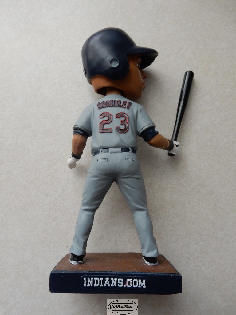
and now here is the bobble out of the box from all sides:


 |
| the bat was separate/removable from his hand |
 |
| i had to hold it because it wouldn't stay flat on its own on this side |
let's start with the positive things about the bobble. they got the skin tone correct. and i really do like this road uniform, it looks very sharp. so i'm happy with that. the wrist compression sleeves and batting gloves are a nice touch, too. (maybe they could have included his shin guard as well, but i'm not gonna nitpick on that.)
i also love the pose they chose for Michael. it's literally a dupe of part of Michael's routine at the plate in the batter's box. right after he gets in his batting stance, he taps his bat on home plate, then swings the bat forward--which this bobblehead portrays--before putting it back on his shoulder and tapping it twice. this is great. MUCH better than the pose he was in last year for his "diving" catch. oh my that was bad because it was so unrealistic lol
ok, time to talk about the bobble's face. here's a straight on shot, close-up:

this is what i wanted to see in order to give a better critique than what i did in my sneak peek blog and truly decide if it accurately resembled him or not. and honestly, from this angle, it just doesn't look much like Michael. but that's kind of normal when it comes to bobbleheads. they're mass produced for cheap and the manufacturers aren't too concerned with their likeness. this is probably the best they're ever gonna do/we're ever gonna get. although, from the (side) angle of the first picture i posted here, you could argue it's believable that it's Michael.
overall, i'm fairly satisfied with this bobblehead and i'm pleased that Michael was once again recognized for being the special player that he is. i'll be shocked if there are any Brantley giveaways next season however, because this is the 3rd year in a row that Michael's had an item representing him on the promo schedule (there was a Brantley replica jersey giveaway on July 27, 2013), and the Indians will probably spotlight some other guys in 2016.
in case you forgot, this is the 3rd Brantley bobblehead that the Indians have included in their giveaways. the first was a diving catch bobble that was given away on September 1, 2014. i wrote a review on that here.
the second was given away during spring training on March 7, 2015. it was the Silver Slugger bobblehead, and while i was unable to get that one (no, i have not yet found one available for sale anywhere), i still wrote a blog dissecting it here.
feel free to check out those blogs for pics of the previous Brantley bobbles and to see which you think is the best representation of Michael. and if you want to leave a comment telling me your thoughts about this particular bobblehead, please do!
No comments:
Post a Comment